
The Reports screen is your detailed traffic view — headline numbers for the period, period-over-period comparison, a day-by-day chart, and then a long stack of analysis panels covering content, acquisition and behaviour. Open it from Traffic → Reports, the Reports sidebar item, or Full traffic report → on the dashboard.
Like the Overview, the whole page is yours to arrange: ⚙ Customize Layout reorders, resizes and hides any panel, per user.
Choosing a date range
The range bar near the top drives the whole page:
- Quick buttons: Today, Last 7 days, Last 30 days, Last 90 days.
- Last N days — type any number of days.
- From / To — a custom start and end date, then Apply.
- vs Previous period — every metric and the chart compare against the immediately preceding period of equal length, so you always see whether you’re up or down.
The metric cards
Cards are grouped so related numbers sit together:
- Traffic — Total Views, Unique Visitors, New Visitors (with returning shown underneath).
- Sources & Devices — Referral Views, Direct Traffic, Mobile %.
- Engagement — Sessions, Bounce Rate (lower is better), Views / Session, and Average Session duration (higher is better — this is real engaged time; see Understanding your metrics).
Each card shows its change vs. the previous period and a Details → link that drills into the matching report.

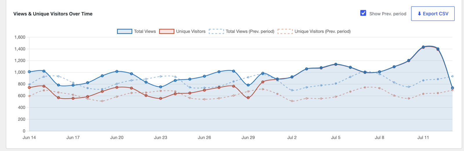
Views & Unique Visitors Over Time
The chart plots total views and unique visitors per day across the range. Tick Show Prev. period to overlay the previous period as dashed lines — handy for spotting growth or seasonality at a glance. ⬇ Export CSV downloads the chart’s underlying day-by-day data, ready for a spreadsheet or sharing.
Pick a single-day range — Today, or any one custom date — and the chart switches to hour-by-hour, with the previous day overlaid for comparison (a day-by-day chart of one day would be a single dot). Every trend chart in the plugin does the same.
The report panels
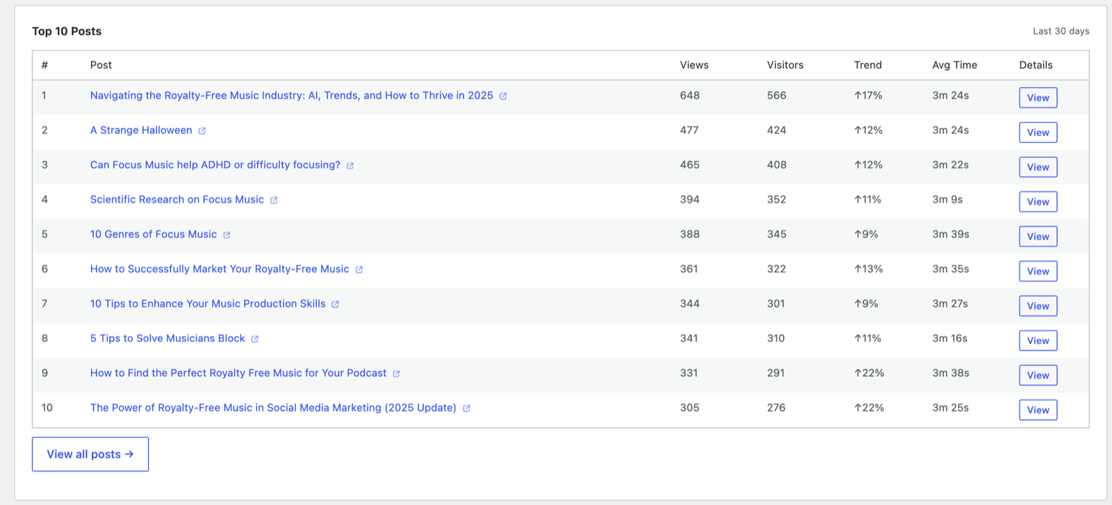
Below the chart, the Reports page stacks focused panels. They fall into three families — content, acquisition, and engagement — and every table follows the same conventions: click a column header to sort (click again to flip), titles link to the live page, View → opens the matching detail report, and a Trend column compares each item against the previous period (“New” means it had no traffic before).
What your visitors read
- 🎵 Top Played Tracks and ⬇️ Top Downloads — your most-played audio and most-downloaded files for the period, with play/download counts and unique listeners. These only appear on sites with tracked media (see Media).
- Top 10 Posts / Top Pages / Top Products — one ranked table per content type, each row with views, visitors, trend and average engaged time.
- ✍️ Top Authors — traffic per writer on multi-author sites, linking to each author’s own report (see Content reports).
- 🗂 Top 10 Categories and 🏷 Top 10 Tags — traffic aggregated by taxonomy, so you can see which topics pull visitors, not just which posts. Custom taxonomies get their own panels automatically.
Where they came from
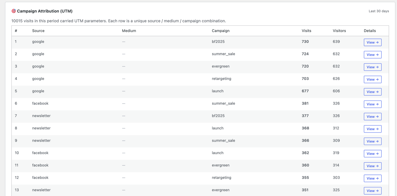
- 🎯 Campaign Attribution (UTM) — every unique source / medium / campaign combination that brought tagged traffic, with visits and visitors per combination. This is where your newsletter, social and ad campaigns become comparable.
- 🔍 Top On-Site Search Terms — what visitors typed into your site’s own search box: your readers telling you what they couldn’t find.
- 🔗 Top Outbound Destinations — the external sites visitors leave to, via tracked outbound clicks.
- 💰 Top Affiliate Links — clicks on your affiliate paths (see the affiliate settings), with unique-visitor counts. This counts cloaked, same-domain links only (e.g.
/recommends/…), matched on the URL path. An ordinary external link with an affiliate ID in the query string — such as?a_aid=…— is recorded as an outbound click instead; to measure those, see narrowing an event goal to one specific link. - 🖱 Top Tracked Clicks — clicks on any element you’ve marked with
data-paj-trackor matched with a CSS selector under Settings → Tracking.
How they behaved
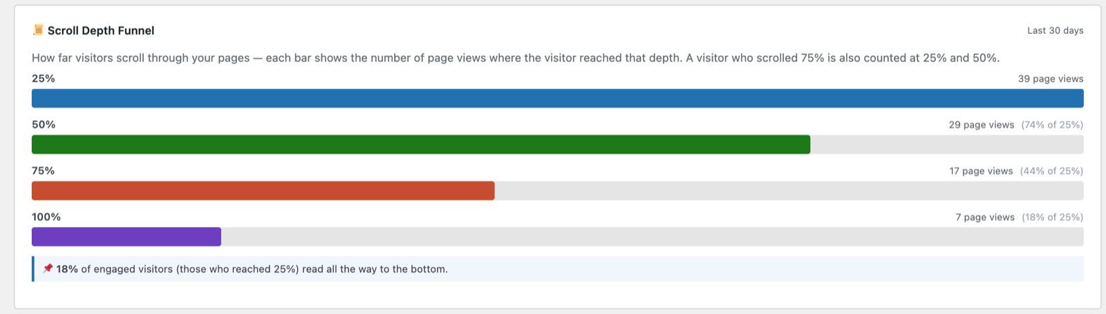
- 📜 Scroll Depth Funnel — how far visitors scroll through your pages, as a funnel of 25% / 50% / 75% / 100% milestones. A visitor who reached 75% is also counted at 25% and 50%, and the insight line tells you what share of engaged visitors read to the bottom.
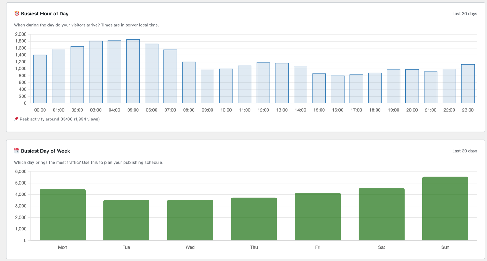
- ⏰ Busiest Hour of Day and 📅 Busiest Day of Week — when your audience actually arrives (server local time). Use these to time publishing and promotions.
- 📊 Session Depth — how many pages visitors view per session, banded.
- ⏱ Session Duration — session lengths, banded from seconds to long reads.
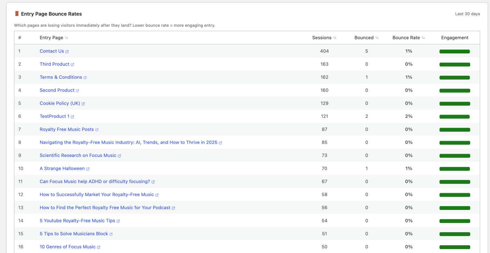
- 🚪 Entry Page Bounce Rates — for each landing page: sessions, bounces and bounce rate, with an engagement bar. This is the “which pages lose visitors immediately?” table — fully sortable, so one click ranks your worst (or best) entries.
- 🏆 Visitor Loyalty — visitors segmented by lifetime session count, from first-timers to your regulars.
- 🎵 Media Conversion — the share of sessions that included a play or a download; the engagement metric that matters most on a music or media site.
📌 Chart Annotations
Mark real-world events — “Published new album”, “Price changed”, “Google algorithm update” — with a date, note and colour. Annotations appear on your date-based charts so traffic changes can be read against what actually happened. Add them here or on the fly as you spot things.

Tips
- The reminder under the cards — average duration reflects only sessions with a measured activity beacon — is why engagement averages stay realistic even when bots inflate raw session counts.
- Use ⚙ Customize Layout to hide metric groups you don’t track, and the width buttons to pair small panels side by side.
- CSV export on this page covers the day-by-day chart data; several panels also have their own exports on their detail pages.
Next: Visitors →
Screenshots are illustrative — see the note on the documentation index.