
The Devices, Browsers & Operating Systems screen shows how people access your site. Open it from Audience → Devices.
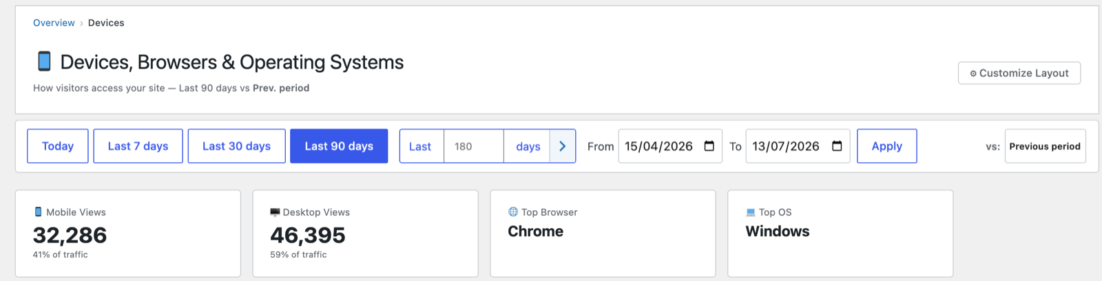
Headline cards
- Mobile Views and Desktop Views — counts and their share of traffic, so you can see your mobile/desktop split at a glance.
- Top Browser (e.g. Chrome) and Top OS (e.g. Windows).
Mobile Views Over Time
A chart comparing Mobile vs Desktop + Tablet views per day, with an optional previous-period overlay and ⬇ Export CSV. Useful for spotting a shift toward mobile over time.
Breakdown tables
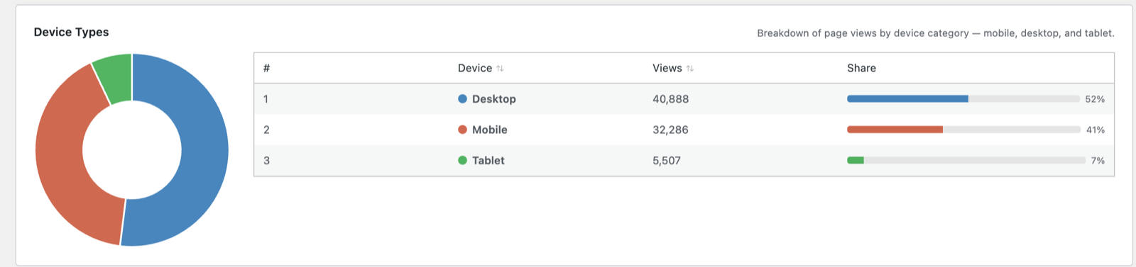
Below the chart, sortable breakdowns cover:
- Device Types — desktop / mobile / tablet.
- Browsers — Chrome, Safari, Firefox, Edge, …
- Operating Systems — Windows, macOS, iOS, Android, …
Each with views, visitors and share.
Why it matters
If a large share of visitors are on mobile but your mobile engagement or conversions lag, that’s a signal to check your mobile experience — cross-reference with Core Web Vitals and, for stores, the WooCommerce funnel.
Next: Content reports →
Screenshots are illustrative — see the note on the documentation index.